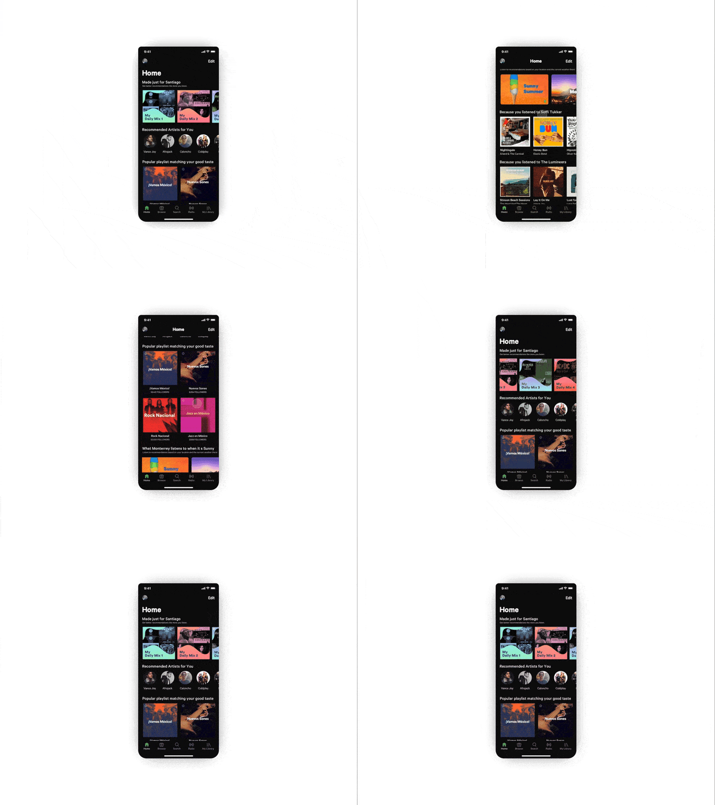
Spotify Home Screen UI Concept
Hey internets! 👋🏼😄
Here's a Home Screen Concept for Spotify I worked on some time ago👨🏻💻.
So my friends and I where talking about how Spotify's home is a bit crowded, there's no much guidance through the screen. There's stuff that you don't even want and you can't remove them 💢🤨.
So I re-imagined how a typical user would like in his/her Spotify's Home Screen 📱.
I started with all the Custom Made playlists Spotify makes based on the music you listen. I think the personalized stuff should be at top because it's one of the strengths of Spotify, the curation of playlists and also because that way you just hit play and you're on flow ✨🌀🎵.
Then a list of recommended artists so you can listen to new music similar to the ones you like. Then we have some matching taste playlist which as I said is a strength of Spotify's team.
Then a friend of mine thought of this feature. Geo-suggested playlist. 🗺️ 🎧 Playlist which would be suggested if you travel to that place, meaning a suggested playlist for skying at Aspen or some Cuban salsa to spice up the party at Havana.
So tell me what you guys think 💬, all comments welcomed and appreciated! 🙏🏼🌟
