Visual exploration | Architecture studio
Hey guys!
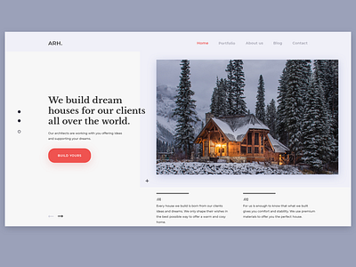
Today I'm sharing another visual exploration for a architecture studio. On this one I tried to focus the user attention on the main image, giving all the information he needs about what the studio can do for its customers. I used a clean navigation and a deep red color for the CTO to enable the potential customers in configuring their own house.
Image credit: Pexels.
Have a great week!
Daniel
More by Daniel Timofte View profile
Like

