Stylin
Stylin's Review.
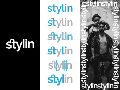
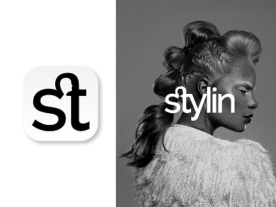
After discussing with the client, it was decided to add a hint (not too pronounced) of a facial shape between the ligature of the S and the T. This characterizes the logo even more and makes it possible to use only the two letters related initials.
What do you think? _____ www.antoniocalvino.com
Social Links: Facebook | Instagram | Behance | Ello | Twitter | Linkedin | Pinterest