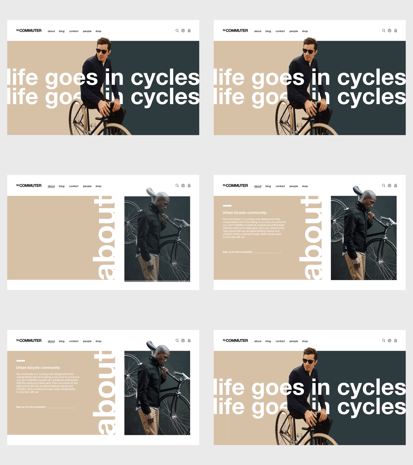
The Commuter - home/about page transition
The Commuter is an open minded cycling community for the casual cyclist. They've been able to welcome people from all walks of life, by not focusing on professional gear nor high level cycling performance, but rather embraced the community spirit and fun of cycling.
When it came to their online presence, they wanted to feel like a genderless environment that is direct, modern, fun and inviting. To achieve this I updated their visual identity with a nature friendly colour palate that I ended up naming "the urban camouflage". It was decided that we would divide the website into two seamlessly separate layouts. One solely focused on giving and receiving information, the other on to function as an e-commerce platform for their products. I challenged myself to go the extra mil for the client and design original cycling related header iconography.
This several month long design project was a very challenging and rewarding experience as it was my first project as a lead designer assigned by an agency. I hope you enjoy watching the end results as much as I enjoyed designing them.
