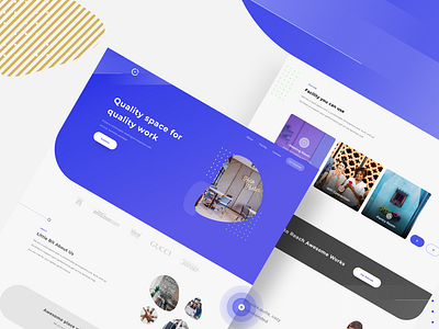
Exploration || Workingspc Landing Page
Hello everyone!
this is my exploration design about working space landing page.
First : In this expolration i want to introduce to describe a shared workspace in an area in Europe
Second : Some things are a little annoying when i see landing pages among others:
o The lack of effectiveness of the landing page itself
o Many distractions
o Ineffective navigation bar
Third :
o Remove distraction and Increase effectivenes,like multiple CTA & weak placement,weak images,inconsistent copy and etc.
o Reduce Navigation Bar to keep visitors focused
------------------
hope you like it,feel free to leave your feedback :)
------------------
Have awesome project? Contact : dickyindrayan41@gmail.com
Have a nice day bruh!
More by Dicky Indrayan View profile
Like


