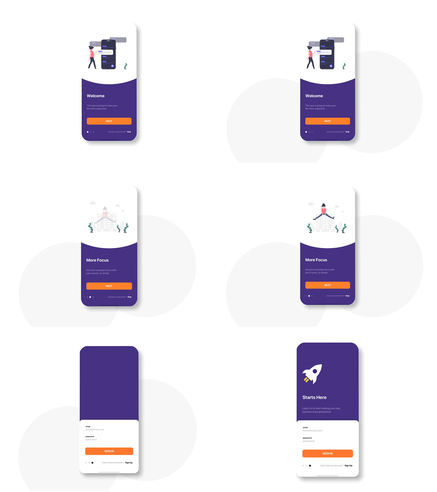
Login Exploration Interaction
Some people put their onboarding screen after login, and the other doesn’t. And average onboarding screen has three pieces of screen. Okay, i’ll cut that. For me, educating how the app actually works is a must, whether it’s a user or not. So, this app created with 2 pieces of onboarding screen and a piece of login form at the beginning, sound fair enough ? 😁
More by Ginanjar Prabowo View profile
Services by Ginanjar Prabowo
Like
