WWLS Branding


Garrison and IWBI have a combined mission to advance culture of wellness and mindfulness
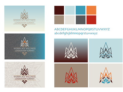
Created initial logo with this and a few thoughts in mind- combining visual elements that typically represent wellness and leadership with a more abstract look so it’s not so literal.
As you might be able to see, used elements from lotus flower and mandala, which typically represent wellness. but also combined it with abstract crown to fold in the leadership focus of the summit. Top portion can also be viewed as a mountain which is appropriate for the event setting (garrison institute) and moreover summit has two definitions, highest point of a mountain and a meeting of leaders.
Mountains are often seen as a symbol of progress or elevation above the rest which again aligns nicely with the mission of the event. Also there is an architectural feel to this shape which obviously lends itself with WELL (the International WELL Building Institute) and the key sponsors, speakers and attendees.
I chose a font to be used on all collateral and materials which is slightly playful but also easy to read and scalable over many applications and I included on the right some design elements that can be used to represent the campaign, as patterns, frames for photos on social, in presentations on our landing page, ect.
I chose brighter colors rather than the more normal pastels you see in wellness branding because I wanted this event to be bold and bold colors represent power and leadership. They demand more attention and action and give a sense of seriousness and credibility pastels do not.
My next post shows two example poster designs. They can be re-sized for social and/or be printed for posters or reworked for any kind of signage at the actual event, The location is primarily dark woods and beautiful greenery, these will really pop in the setting.