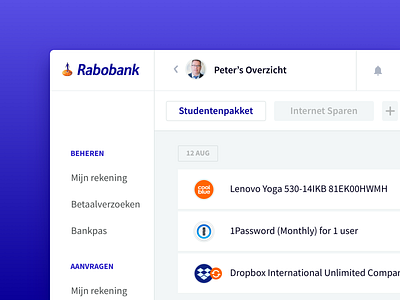
Rabobank — Visual Branding Concept
Every time I use a Rabobank product, the overall design let’s me down. Understanding the constraints they face, I think it could be a bit more visually pleasing. Start working on this a couple of months ago, but figured it’s something worth sharing. Looking at N26, bank products can be beautiful.
More by Rob Scholten View profile
Like
