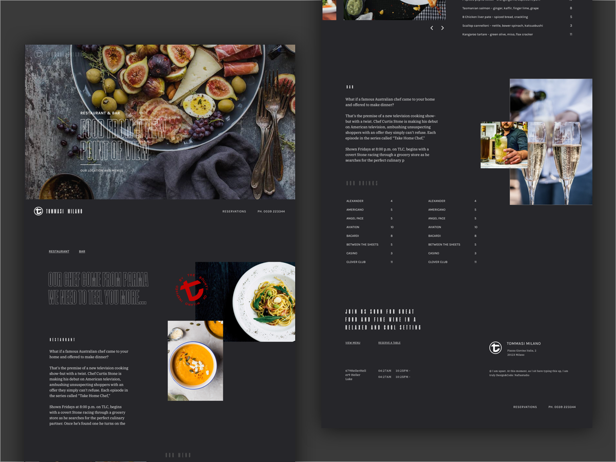
Tommasi Website - Restaurant e Bar page
This shot is part of the second concept made for Tommasi Milano website. Based on css flex column, on over the selected one grow from 25% to 50% and other column shrink in proportion…. sorry for my english but i think is important to describe the shot and the development. The difficult part is respect concept and layout but made all responsive and dynamic .
For image credit <<< preview shots
Naturally Unsplash
More by Nafta Studio View profile
Like

