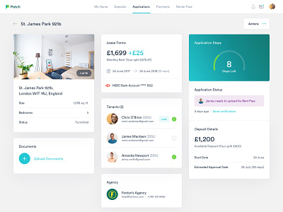
Patch - Dashboard - Deposit Application - Color #2
Hi folks!
This is part of the Patch dashboard. This serves as detail page for deposit applications. Here you can see details, tenants, statuses and application progress. This is part of the exploration we did in terms of color palette.
The overall brand and visual language were constructed to speak to a vast demographic. Using light visuals followed with a contrasting color palette I feel we managed to create something visually pleasing, functional and user-friendly.
What is Patch?
Patch is serving renters with the option to receive a Patch deposit and keep hold of their savings to spend how they see fit. Making apartment hunting easy. In short, Patch takes care of deposits for you.
How did we help?
We were approached to support their new business model with an iOS overhaul, new branding, dashboard, and website. Delivering both design and front-end development.
Check real pixels in the attach.
All the best,
Filip

