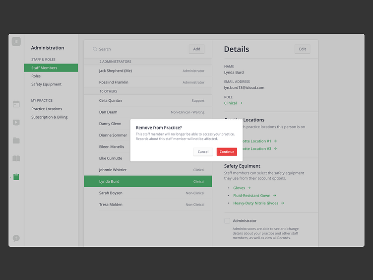
Modal Alert
The biggest thing that tripped me up in designing these modal alerts is was the button placement. It’s not a new problem, but I think it’s so difficult on the Web because there is no system precedent to follow. Either way, I opted for the macOS-style button placement, which generally makes more sense to me.
More by John Wickham View profile
Like
