Shift & Nudge Artboards
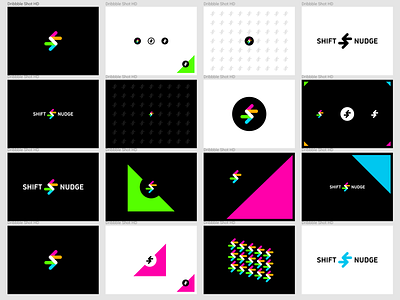


Stress testing smaller sizes and solid colors of this mark. Fine-tuned the sizing relationship of the logo lockup. Exploring patterns...
Finally ditched the overlay/opacity idea on the colors. I did like it a lot, but it presents unnecessary problems here and there.
I doubt the single color (black on white) would get much use, but it's nice to have it.