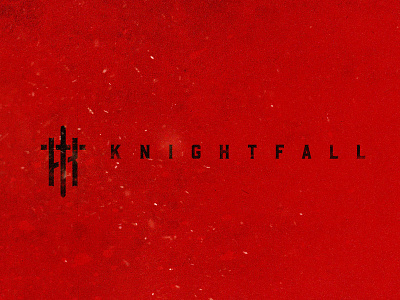
Knightfall Season 2 Branding
Knightfall Season 2 will have a much more visceral feel than the first season. More dirt, grit, blood and gore. Many battles will be fought between scenes of dastardly political intrigue.
–
This branding goal is to draw in the premium scripted viewer and showcase the renewed energy and appeal. It elevates the ire of the king, hungry for power and set on total annihilation. This brand direction was a historical symbolic approach using the "Sword" and "K" to create a bold and classic mark for the new season.
–
Design collaboration: Chad Palmer
View all tags
Posted on
Jan 31, 2019
More by Paul B Drohan View profile
Like

