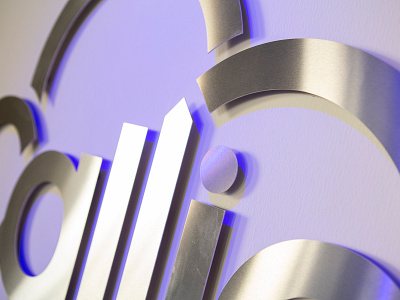
Calligo - Every Cloud...
It has been 5 years since we originally worked with Julian on conceiving Calligo’s brand. We are now proud to put our name to the updated brand for the incredibly successful Jersey company. Julian and his team have always put a strong emphasis on the importance of their brand and it’s relevance to where it is as a firm both for it’s staff and it’s clients.
They are always moving forward and evolving and we love going on the journey with them. This change came about in line with their huge expansion both in size, investment and global reach. It was therefore of even more relevance that the brand aligned with them in this process.
We are often presented with rebrand projects that ask this conundrum of us. When a company ‘grows up’ or becomes ‘global’ you see all too often the results sucking the personality and therein life out of a brand. For us it is key that you marry the 2, making a company appear more grown up with empowering the brand and communications with the core value and philosophies that are the DNA of a firm.
We believe that successful brands are able to develop and mature whilst keeping their core values in tact. Our brand solution Is totally re-imagined, yet feels familiar. The logo and word mark have been amalgamated to create a clearer and more mature form. The new typeface is thicker and more robust yet feels approachable, uncomplicated and fun.


