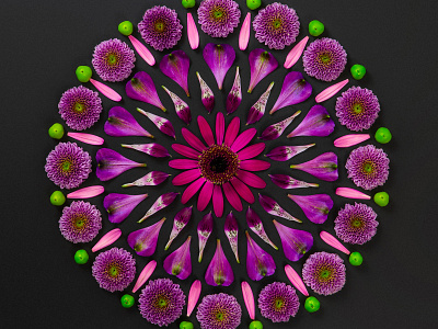
Flower Power
Carey believe that open and creative partnerships which encourage constructive challenge are more rewarding and will achieve outcomes far beyond what can be imagined by one individual. This sentiment naturally overlapped into our design projects with them, resulting in the breadth and beauty of work you see here.
We began with the brand. The logo marque uses the rotation of the letter C so they overlap at multiple points, masked within a circle it creates a kaleidoscopic pattern. There are notions of transparency and many differing forms working together to create one cohesive and collaborative whole. Combined with an ultra-bold logo type this brand has a sense of approachable exuberance.
Extending this kaleidoscopic idea into the visual language led to a hands on approach using natures vibrancy to create artwork that mirrored the idea behind the marque. All painstakingly laid out and photographed in house, we developed 3 variations including a meticulous deconstruction for a stop motion video.
The client's website brief was to create a digital experience that was totally different to all of their competitors both visually and structurally. The site boldly places the businesses beliefs before their services and is full of design detail and development flourishes. A thoroughly rewarding piece of work that has utilised the talents and skills of our entire studio.


