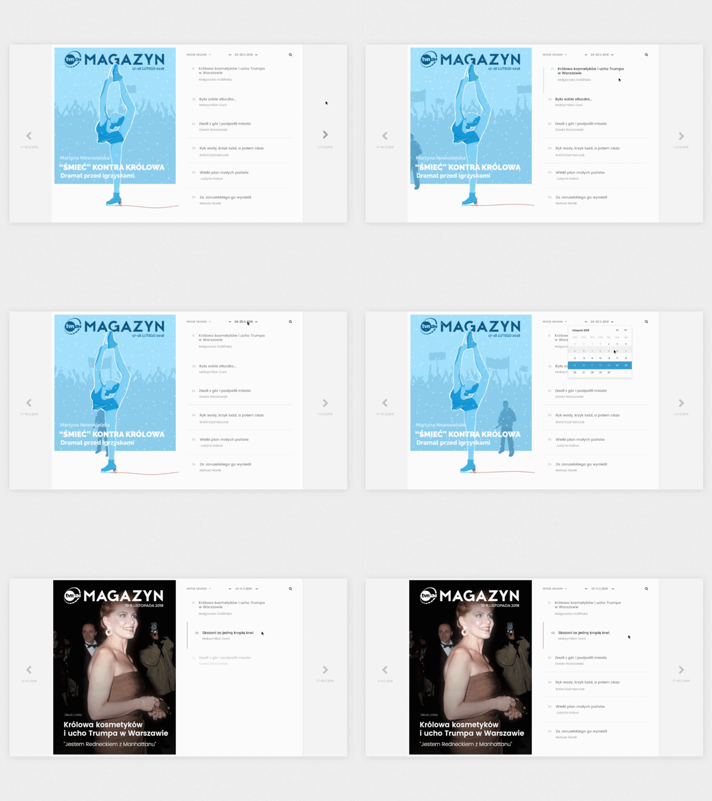
Weekend Magazine - Interactions
Hi dribbblers!
I recently worked on redesigning the UI/UX of weekend magazine. I was inspired by classic paper newspapers 🗞️ and especially The New Yorker's illustrated covers. The concept is to create new cover (with an animated illustration or regular photo) for each new portion of articles that appear every weekend. List of articles is presented in a way of interactive table of contents.
Let me know what do you think, how do you like the interactions and don't forget to press "L" to appreciate it! 👌
More by Maja Szwajcowska View profile
Like
