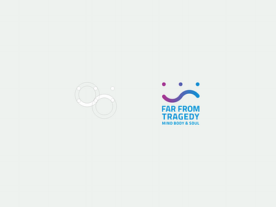
Far From Tragedy logo
This is a very unique logo idea.
The curve is basically a path for travel.
The dots in the logo represents human element.
If you look closely, there are two shapes.
the shape on the left is the smiley face while the other shape is the sad face.
More by Shams Tamu View profile
Like
