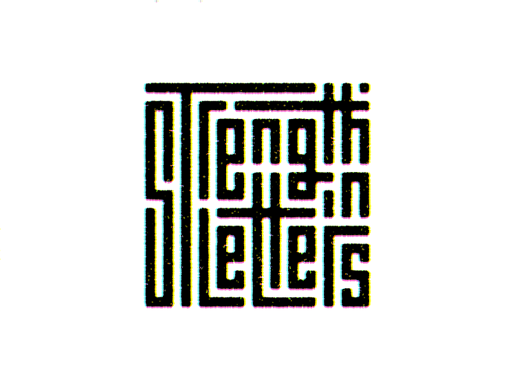
Strength in Letters.
Ignored legibility and focused more on the letter forms and the maze aesthetic in this typography piece.
What do you think about this?
--- More works on my Instagram • Behance • Twitter