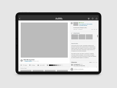
Dribbble App - Layout Concept
I've been utilizing the native app for @Dribbble, on my iPad more regularly, and couldn't help but notice that the hierarchy of the "post" layout seems off to me. For a platform that is used to showcase progress and finished work wouldn't you want to make the images uploaded more of a focal point?
This is my unsolicited revamp of the post page, utilizing a scroll view for the content (and feedback) vs. the area where the visuals are shown.
More by Larry Levine View profile
Like
