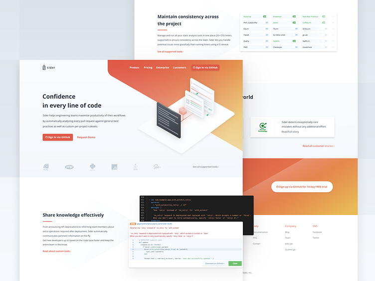
Landing Page Redesign for Sider
A website landing page redesign for Sider, you can check it live here (https://sider.review/).
Went for a more corporate enterprise-like feeling, and tried my hand at isometric illustration. Hope you like it!
More by Anastasia Kas View profile
Like
