Points Of Contact
Working on a redesign of the Premium Choice website, introducing a subtle rebrand with consistent use of corporate colours.
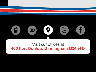
I'm currently focussing on the main points of contact for the footer links, "traditional" communication types first then the popular social networks. The icons are intended to simplify the message with the modal box assisting the user with additional information.
I'm thinking the telephone icon could do with being the traditional shape rather than this mobile version.
More by Si Jobling View profile
Like
