Concept of Vespa website
Hello,
This is the concept of a web interface for Vespa.
This is just an experimental work. Attempt to improve and simplify the appearance of the interface.
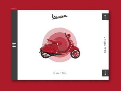
The main goal: to unload the interface, add space and focus on the company's product. Switching between models of scooters occurs by clicking on the control buttons
on the right side of the screen. When you hover the cursor on the scooter itself, an animation appears (pulsing circles in the color of the scooter itself), which slightly enlivens the page and dilutes the minimalist design. By clicking on the product, the user gets to the page of a particular scooter with a full description and characteristics. On the left side of the screen is a non-standard menu.
I would be grateful for any comments. Thanks for attention!