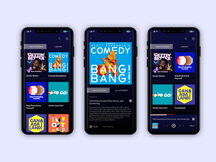
Daily UI #009 Music Player
For the music player challenge I took a look at the podcast app that I use from Apple.
I love my podcasts but find that the IA for the podcast app to be overkill. I have on many occasions begun playing episodes I don't mean to play, deleted / unsubscribed from shows I don't mean to unsubscribe from, and generally fumble my way through the app as I try to find the most pertinent things I'm there to do.
Of course it would be a mixed back of requirements to overhaul the app, and would require deeper consideration that a makeover in one afternoon. In consideration of that, here's what I've done that would at minimum appeal to my own needs as a user:
1. Removed the bottom navigation and combined new episodes and the library under one page filtered by tabs when new episodes are available. I rarely use the navigation at the bottom and typically just concern myself with what episodes are new from my shows.
2. Removed next episode details in the homepage summary and instead simply listed all new episodes under a "new episodes" tab. The user can than click on that show to see full episode details in list form.
3. Include the skip backwards and forwards features in the minimized player controls. I like to skip forward and ahead in podcasts depending on the show I'm listening to. I also included a "next button" as some episodes have a lot of repeat sponsor details etc. at the end of each episode so I can just skip to the next if I so wish.
4. Something I realize Apple would probably never do, I darkened the UI so that it more prominently features the podcast art, something akin to to the effects of Spotify's UI treatment.
Enjoy, fellow dribbblers!
