Production report
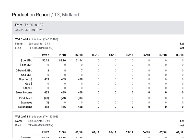
This page still feels messy to me, but there were pretty strict requirements to get a ton of data on a single page. Production data for an entire year, for each Well in a Tract, for the entire portfolio meant that this report could be massive. In an effort to reduce paper consumption, I tried to stick as much information on a page as possible, settling on two Wells per page.
I tried to use borders and background color to help keep it clear what Tract a Well was a part of, but it meant that some of the spacing ended up feeling a little dicey, especially where the well metadata meets the table.
I haven't seen a lot of print design on Dribbble, except for promotional material. Very interested to see how other folks have handled this sort of work.
