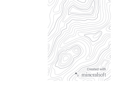
Report cover
Used the topographic pattern from Hero Pattners by Steve Schoger to add a little flair to our PDF reports.
The previous revisions were just text on a page, and felt a little bland. I experimented with a couple different methods for helping the branding remain legible against the patterned background, and ended up going with a heavy white shadow on the text. I think it keeps it clear and distinct, without taking over that part of the page.
More by Alex Price View profile
Like

