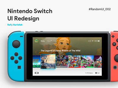
Nintendo Switch Home Redesign
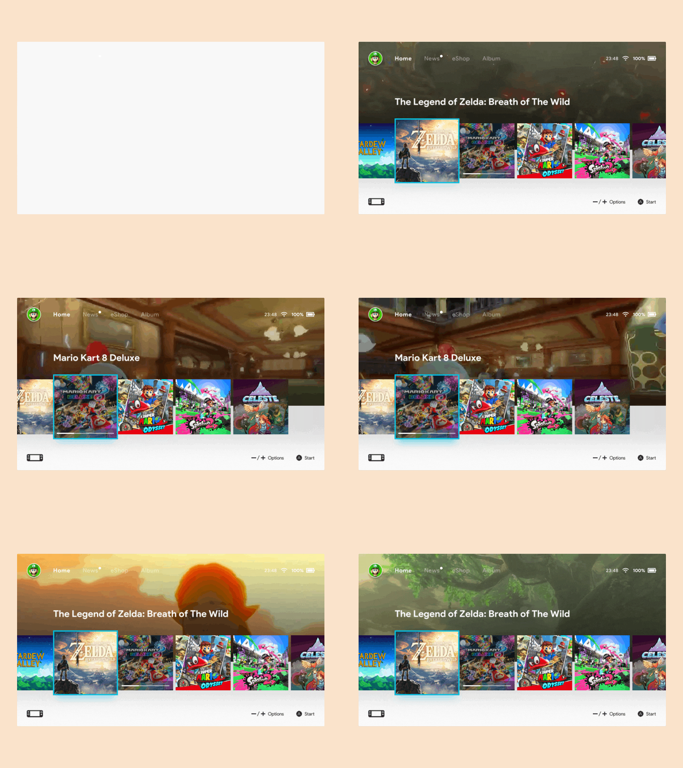
I completely forgot that i already finished creating the Interaction of my previous Nintendo Switch redesign post and now i think it's time to share it Dribbble so i'm hoping i get some feedback from you guys!
My feedback for this design is the background video might looking good on visuals but i remember that Nintendo Switch hardware might not able to handle this well :/ (and also it feels so unnecessary).
The top menu part needs some dark overlay so it can be readable.
I like the interaction but it needs more snappy right the current Nintendo Switch UI.
I also have another version which more cleaner and simpler that still in the works ;)
More by Rafly Nurfallah View profile
Like


