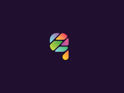
gauffin group
Idea:
As I have been looking at company profile, I was thinking mostly about “designing startups” part - how to convey them into mark, and show theirs uniqueness and originality. Basicaly, company provides startups and make them happen. I simply put them into “g” letter, skew them into 45 degrees to emphasise their rapid growth. To show their profile diversity, I added some nice looking and appealing colours. Type is ofcourse designed “from zero”. I’m not sure yet which font I will recommend as primary. lower part of “g” letter suggests an arrow, symbol of expansion and growth. This kind of solution provides great possibility of using mark elements in corporate identity.
More by Cris Labno View profile
Like

