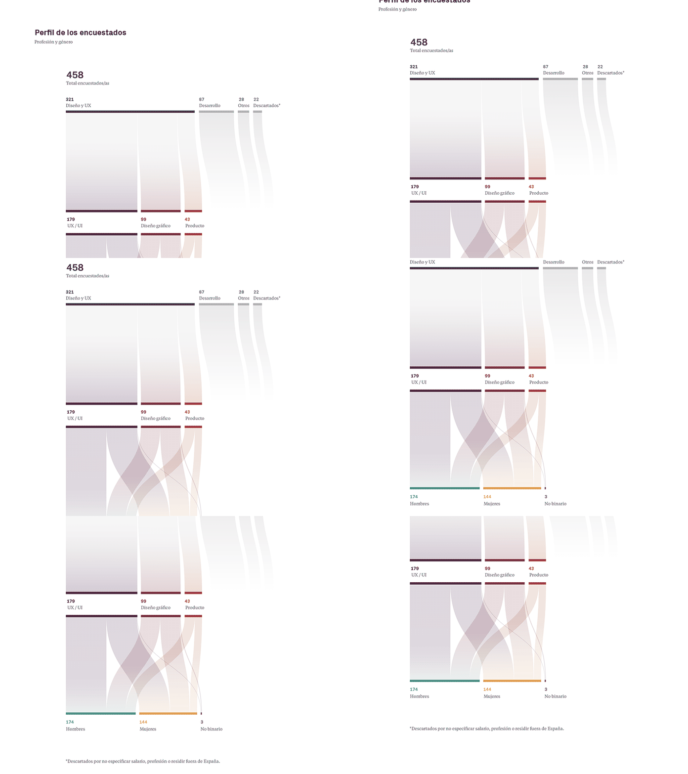
Alluvial diagram - design salaries
💵 Let's talk about money! ⠀⠀ ⠀⠀ ⠀⠀
⚪️ Do you think you get paid what you're worth as a designer? ⚪️ How does your salary correlate with your happiness at work? ⚪️ How big is the gender pay gap in the design community?
We all have a lot of questions about this topic and I think we should be talking about money much more. But then I'm the first one not feeling confortable with it.
In search of answers, fellow designer Cris Busquets created an anonymous Excel sheet and asked the design community in Spain how much they get paid. Being an anonymous document, everybody would feel safer.
484 designers participated. Although it is a big number, we would need a bigger one to get an accurate picture, but it already gave us some clues.
The Excel sheet needed some work to paint an overview of it all, that's why I reached Cris and offered help. I turned the data collected into visuals, using various data visualization techniques and tools.
In the next few days I’m going to share the data visualizations with the results from the questionaire. (Pst, I already shared it on Instagram)
This is the first of 8 data visualizations! It shows how I cleared out respondents that did not live on Spain or that were not designers. Then they get sorted by speciality and gender.
