Concept of Starbucks website
Hello Dribbblers,
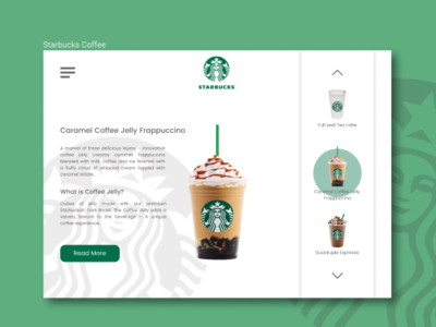
This is a web interface concept for Starbucks.
In this work, I tried to simplify the appearance of the interface as much as possible, while not leaving far from the concepts and color combinations in the traditions of the brand.
The emphasis is on the company's main products - beverages. This is all that worries Starbucks fans. Background information is in the menu.
I would be grateful for any comments. Thanks for attention!
More by Anton Tymoshenko View profile
Like
