Harp Boys Co.
Harp Boys Co.
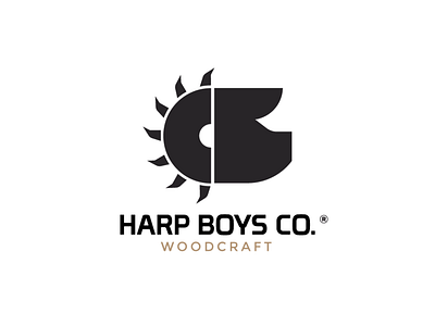
Logomark design for a fine woodworking company.
.
The client wanted to incorporate a round saw in the design as well as a pig as it is their brand symbol.
I managed to combine these two elements as a half saw and a pig head and create this logomark.
Need a logo / Branding?
Contact me in DM or Email 📩
More by Filip Panov View profile
Like
