UX | Like Or Unlike


This shot is to try two things.
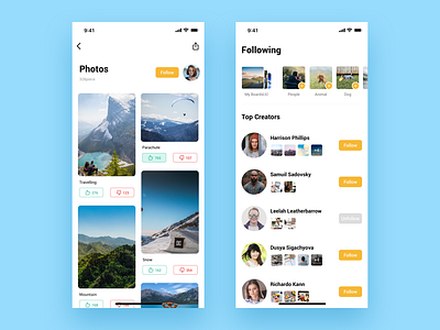
First, let users express their emotion about the picture with "like" and "unlike". And the two numbers is a symbol whether the picture is good or not.
Second, put "My Boards" and "Recommend Boards" in the horizontal layout so that there will be more space to use in the first screen.
Hope these can give you some inspirations. Press "L" if you like. :)