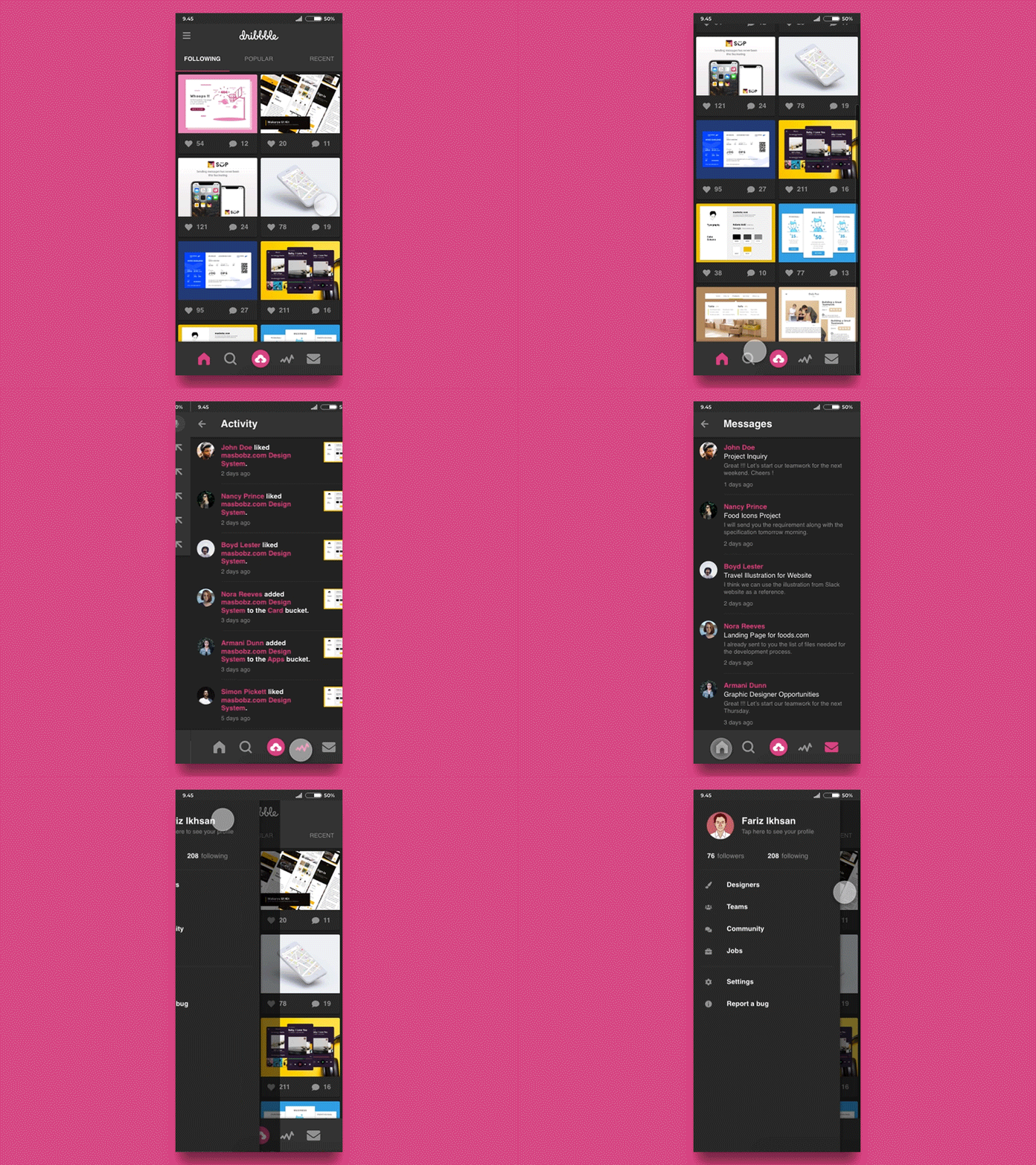
Dribbble Mobile Apps Redesign
Dribbble Mobile Apps Redesign
------------------------------------------
Since a few months ago, Dribbble mobile apps already released a crucial feature for activity to check all of our notifications.
Even though, based on my experience after tried the new feature and almost the whole function on the apps, it can be improved on some aspects.
So, I started to write it down on my sketch book to note all of the part that can be improved.
After I finished the notes, I made the list of improvement priorities to be designed first. And for this time, I focused on redesigning these two aspects:
- Activity icon that placed too high, that make accessing process for this feature on the device with bigger screen harder.
- Redundancy of feature that placed on the sidebar menu and on the top navigation (in this case is activity feature)
- Some menus on the website version is not displayed on the mobile apps version. Maybe this decision was made, so the mobile apps version can be more simple and clean. I want to give it a try on the redesign version.
Here is the solution that I provide for the improvement to solve the above list of priorities:
- Designing the bottom navigation to place all of the crucial features
- Displaying the additional menu from the website version into the sidebar of mobile apps version, and also removing the redundancy of activity features from sidebar.
