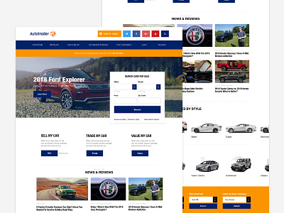
Autotrader Redesign
Overview & Thinking:
Today I want to introduce the New Autotrader Redesign Website.
The problem with the Autotrader website was that the user was not seeing the Login / Create Account Links. They want me to redesign the top portion of the website to increase account creation and logged in users.
Additionally, we'd like you to explore some form options for said login / create account." Sometimes, it doesn't take much to change how a user interacts with an interface. For this one, to attract the users to the top of the page where the "Signup/Login" area, I just created some nice white space and added a bright primary button to draw the eye to the top of the page on load.
Normally, I'd come up with 3-4 designs so we can test them against each other to see which ones perform the best – so with this, it's an educated guess that this will perform better than the current state.
Design Program:
Adobe XD
