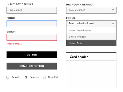
Sample Style Sheet for WIRED
Hello there! 👋
I helped WIRED Magazine change their business model from ads to subscriptions. As a part of that, an efficient subscription signup was critical. Here’s a small style guide I put together for it. While I had to honor WIRED's branding, the Design Director and I discussed areas we could change to meet WGAC 2.0 AA.
See a shot of the initial subscription sign up that launched here. You can also check out how I approached writing error messages for the sign up here.
More by Tiffany C. Yu View profile
Like
