Copywriting Process for Product Design
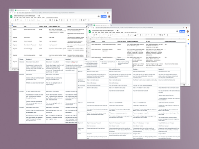
Copy is something I believe needs to be as thoughtful as the design decisions for the UI. These screens show how I approached thinking through the copy so it’s clear, concise, helpful, and contextual.
I helped Polco test an onboarding idea and some of the questions I thought about were:
💡 What tone does this brand have and how do you inject it into the product?
💡 What are some different directions you can take?
💡 What is the right balance between a narrative and giving helpful information?
At WIRED Magazine, I helped design a new online subscription sign up for their paywall launch. The Product Manager had generic error messages from other Conde Nast brands. I worked with him to ensure error messages were clearly stating what went wrong, why it possibly went wrong, and what the next step the user should take to fix the error.
