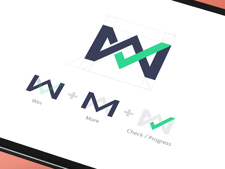
WM Logo
The new logo for Winmore I worked on, and its meaning. Simple, and they wanted a logomark instead of a logotype. That way, the glyph can be used independently, and it fits on a lot of places.
More by Edwin "Kay" Delgado View profile
Like
