Brand Colors Est. 2018
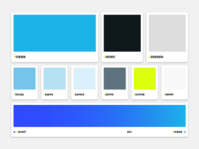

When we set out to rebrand in 2018 the first place we started was with our color palette. We needed a facelift from the orange and blue palette we adopted since the company started. To accomplish this we gave the blue that has been true to our roots a facelift and brought up the brightness to add new life. We replaced the orange with chartreuse to mimic the new direction we were going with our rebrand. With the addition of other new primary and accent colors we created a color palette that is full of energy while staying true to ourselves.