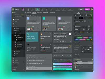
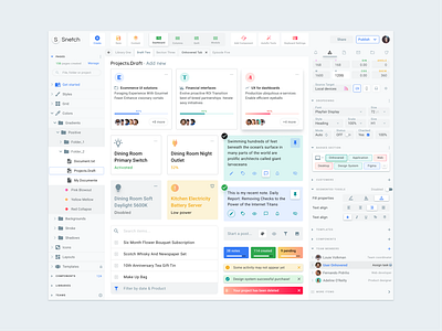
Desktop Software UI Template
Template Overview
This screen is the one of a bundle from Material Desktop System - a component-driven Figma design system ready for deployment within your organization or a single project. Responsive, scalable, constrained layout and precisely crafted by following the 8dp grid. Color palette applied just for eye-catching demonstration purpose. By default, it comes colored to be more convenient for business applications.
The Approach
This template is a concept for complicated desktop software UI, inspired by a classic design tool, containing a lot of small design widgets compatible for both web or installable (e.g. Windows-based) software and comes production-ready for light & dark themes.
Components Overview
This application design powered by the classic 3-columns layout and set as ready for customization. You're free to move, swap, resize and set new colors for every UI items, which are:
• Application bar
• Expandable navigation tree
• Compact Tabs
• Progress Cards
• Status Cards
• Text-edit Cards
• Search Panel
• Compact Inputs
• Chips-driven Panel
• Segmented Controls
• Selectable List
Most of the items are equipped with considered statements as onFocus, onHover, onClick and etc. Each additional statement is powered by Figma global styles. So you can detach any item, declare as custom component and reuse for your development purposes.
Check out more powerful Figma templates and React components made by Setproduct team - a crew who cares about the detalisation


