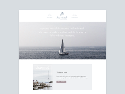
Sparhawk Homepage Dribbble
This dreamy Squarespace project brings me back to childhood summers in Maine. ⚓️
I wanted to capture the stillness and wild beauty of the landscape. To that end, I started with a broad palette of soft natural tones inspired by natural elements like granite, moss, lupin, and fog. As the design process progressed and I searched for stock photography to incorporate into the design, I narrowed the palette considerably. Ultimately, the coastal fog color from my original palette became central to the entire design.
User experience is always in the front of my mind when I'm designing a website and this was no exception. The biggest issue was optimizing the mobile experience. To that end, I used a simplified version of the logo on the mobile site and removed extraneous design elements that looked amazing on the desktop site but didn't do the mobile user any favors.
You can view the live demo of the site here.
