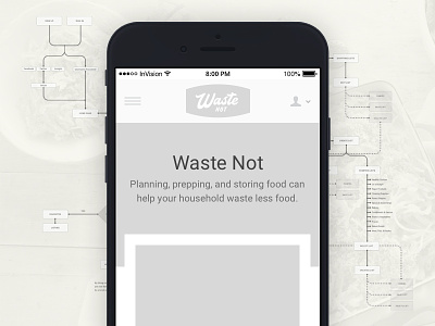
Waste Not Wireframing, Prototyping, and User Testing
My wireframe prototype was created to uncover my assumptions, identify pain points, and discover missed opportunities that could enhance the experience.
Pain points were exposed by assigning specific challenges:
* Show me how you would create a shopping list
* Show me how you could use this app to learn more about food waste
While reviewing my notes overlaps were identified such as difficulty creating a shopping list, a lack of correlation between recipes and food waste, and clarity on certain functionality, for example, how to use a custom checkbox on favorites to create a shopping list.
I addressed these user pain points in my wireframes and prepared for a second round of user testing. Testing was done with a new group of users who were provided the same list of questions and challenges. During observation a majority of the group were now able to create a shopping list quite easily and immediately saw the relationship between features of the app and reducing food waste. This feedback helped solidify the product direction and guided the color palette and typography choices used in the visual design explorations.
I added features that not only notified the user of their success in reducing food waste and provided educational opportunities throughout the experience in the form of helpful resources. These features include:
* Notifications that highlight the number of shared ingredients across your shopping list as well as reminders to check before you buy
* Favorites recommendations that share common ingredients with other items on your shopping list
* Article and video resources that educate users on food waste and how to prevent it

