Waste Not Style Tiles


The visual design was driven by creating an app that was practical, informative, helpful, focused and economical. A lot of the content was editorial so I focused on better displaying that volume of information.
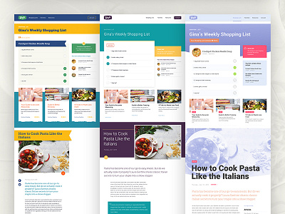
These components were rolled out across the wireframes at mobile, tablet, and desktop viewport widths to see how it all worked together and aligned with the theme of the product.
This project helped me discover that while many people know how to shop and plan their meals many have a difficult time addressing the food that they waste. My interviewees almost unanimously agreed that an app that helped them reduce their waste and save money would be extremely valuable to their day-to-day lives.