Kframe Logo Design
Logo design created for a photography studio based in Bologna.
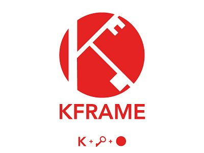
For the realization of the Kframe logo I used an ancient key, lucky symbol.
To represent the logo in a synthetic way, Kframe's K joins two keys positioned on the arms of the letter.
All within a circle of red, with the aim of communicating a harmonious, strong and gritty space.
More by Filippo Gasbarro View profile
Like
