Slack New Logo Rebranding, take #2
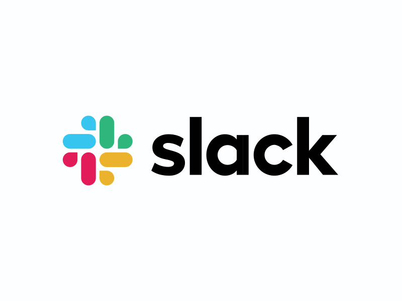
The instance I saw the new Slack logo, it felt a bit awkward. I know the guys at Slack felt their former logo to be impractical - they even called using it as "awful", but I personally always found it original, interesting and actually very well balanced color-wise. And it was a fun and dynamic logo, the way it was skewed on its side in an odd angle.
I think they went too far away from their old logo and ditched all the fun to a boring looking and mostly fragmented form, standing still at a 90 degrees angle. And man - to be honest I see no speech bubbles over there, just rubber duckies! But that's me...
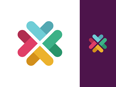
What I tried to do here is some reverse engineering regarding the colors to show my love to the original unsaturated shades, and also put back the fragments together to a more cohesive form. I then tilted it by 45 degrees trying to bring some of its original mischievousness.
And I know it was very important for the Slack team - so I tried to make it work well both on a white and on a dark background.
What do you guys think?

