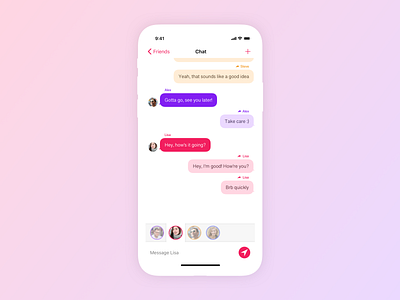
Daily UI 013: Direct Messaging
Back from a little break.
This one took a long time and went through several reworks.
My initial plan was to just make a normal messaging app, with the addition of the multitasking bar you see at the bottom, the idea being that it allows for quick switching between recent chats, so you don't have to go back to your friend/conversation list every time.
I struggled to fit the bar into the existing design, so I took a step back and considered the actual purpose behind its addition: to allow faster context switching between conversations. So why was I still putting each conversation in a separate screen?
I was reminded of how private chat works in games like WoW, where messages to different friends can all appear in the same chat window, which works great. So that's what I did!
Colour visually groups messages to and from the same person. Those same colours return in the quick switcher, and dynamically change the appearance of the send button and navigation bar depending on who is selected, so it's always clear who you're typing to.
Let me know what you think!
