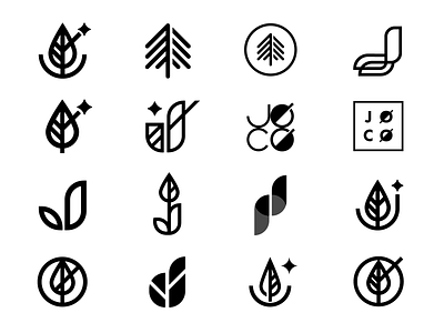
JOCO - Logo Identity Iterations
These proposed logo iterations were created for my buddy Zack Joseph and his growing conglomerate, JOCO 🍃
•
JOCO (Joseph Company) offers a unique range of quality products, with the largest arm of the company comprised of local horticulture fundraising offerings. We’ll also be launching his online clothing boutique coming down the pipe very soon—stay tuned for all that!
•
My focus with these concepts was to depict a sense of quality and strength, while creating an identifiable, versatile mark to run in step with his diverse product line.
•
He also wanted to pay tribute to his brother Tyler’s band (Twenty One Pilots) as a portion of Zack’s personal brand are TOP fans. You’ll notice several of these marks give a subtle nod to the “/“ commonly shown in the band’s visual identity.
•
Would love to hear your fav 🙌Give an "L" if you like this post 🙃
