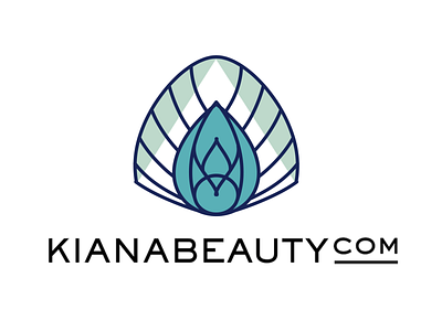
Kiana Beauty Melbourne – brand development 1.0
This is one logo layout I developed for a client in Australia. They are a family business, owning a few pharmacies and shops that sell perfumes, cosmetics and all things beauty. They also own a day spa and nail studio ... you get the picture. They were already selling online but through the pharmacy shop and wanted to create a new e-commerce site and therefore establish a brand that says "beauty" rather than chemist.
_
They came to me with the name Kiana Beauty and the request to have a peacock and a somewhat art deco feel to it. The client had a hard time to decide because I gave them two options, which they both loved.
_
Often the problem with several design layouts is, that clients like a few and then try to combine all in one ... which will make most creatives cringe and regret that they showed options in the first place ... you know what I'm talking about, right?
_
Not in this case. The client understood that both layouts answered the brief but were not interchangeable. Dream client!
_
(I will post another few shots to show you what they selected in the end and how we managed to incorporate some of this layout WITHOUT creating a frankenstein! :)
> https://dribbble.com/shots/5872975-Kiana-Beauty-Melbourne-brand-development-3-0-detail
