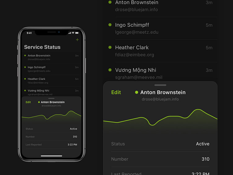
Bottom cover detail modal
One of the most interesting things to me that’s going on in iOS’s design lately is these modal views that are presented from the bottom of the screen and can be pulled down to dismiss. It makes using bigger phones much more tolerable (RIP iPhone SE), and doesn’t take up the whole screen when the content doesn’t need that much space.
More by John Wickham View profile
Like
