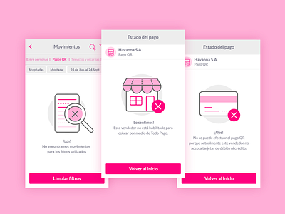
Todo Pago - Empty states & feedbacks
This is a design proposal for the screens of Todo Pago PEI mobile app.
We created a system of visual resources to give more life to the current version of the app in instances of empty states, feedbacks, and particular situations of the interface, in order to be more friendly and empathic with the users at the different moments of the interaction.
Credits:
UX/UI Designers: @Norali Emilio & @Alex Emanuel Taborda (That's me!)
More by FluxIT Soft LLC View profile
Like


