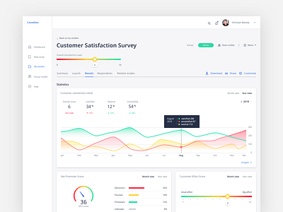
Customer Satisfaction Dashboard
This is a Results page a researcher sees after his study was launched. I've designed it for Online research recruitment service project.
In this project, I've learned the ways of organizing information in a way that brings value to the user. As the service presents lots of data to a user, it is a must for a designer to prevent user's overwhelming, caused by that information. Placing highlights of the results first and providing a flexible hyperlink web to the details, helps the user to navigate between the different content naturally.
It was helpful to think beyond obvious jobs of the researcher, as collecting data for the study. Understanding the reason why and how he wants to use it and implementing that idea in the service makes it more helpful for researchers. It enabled me to design a service, that will not only provide that data but highlights the trends, explains drivers and helps to solve the problems the user faces.
More about the project https://www.uxfol.io/project/04d23043/Online-Research-Recruitment-Tool
Happy to hear your thoughts...
Show some "L" if you like it.
