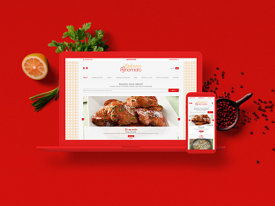
Sabores Ajinomoto Website
With the redesign of the site, we allowed users to enjoy a better navigation experience in the services, made possible by a new, elegant and modern layout.
The strategy was based on the indicative of the research that we developed and, from this, we applied a more prominent revenue research area, with a stronger visual appeal linked to the recipes, more objective and focused information.
It required a new user journey, improving the site's current UX by analyzing the existing sitemap, implementing a new one, and designing the new set of wireframes for the entire site.
More by bruno arruda View profile
Like
